 Linux, Linux OS, Free Linux Operating System, Linux India Linux, Linux OS,Free Linux Operating System,Linux India supports Linux users in India, Free Software on Linux OS, Linux India helps to growth Linux OS in India
This scripting language avoids integrating analysis and display capabilities and instead focuses on providing precise and flexible control over the display of technical material.
Like other computer users, scientists sometimes find themselves torn between simple tools and complex tools, between ease of use and power.
Take writing, for example. The simplest tools for writing are those of the office-suite variety, because they are GUI-based. If you can click and point, you can produce results quickly without climbing a steep learning curve.
However, you might also pay a price for this shallow learning curve. Many technical writers who make extensive use of mathematical notation find GUI-based products to be both limiting and annoying when used for anything but a one-pager. For example, graduate students in our research field (Physical Oceanography) often write hundreds of equations in their dissertations. Almost without exception, these students use markup languages (mostly TeX and LaTeX) for this work. It must be admitted that markup-based writing tools are harder to learn than GUI-based tools, but the effort of learning is rewarded with precise control over output that is aesthetically pleasing and flexible enough to meet all reasonable demands.
What goes for words also goes for pictures. For quick jobs, it’s lovely to use a GUI-based graphing package or a spreadsheet. However, many users prefer a markup-based system for complicated illustrations, for the same reasons they prefer a markup-based system for complicated text. An additional factor is that GUI-based systems cannot help with illustrations that must be generated automatically without human intervention.
An interesting example is provided by storm-surge forecasts prepared by oceanographers at Dalhousie University in Nova Scotia, Canada. Storm surges are unusual elevations in sea level that are driven by anomalous wind stresses and low atmospheric pressures associated with storms. These surges can cause considerable damage to low-lying areas. Since damage is worsened if a surge happens to occur at the time of a high tide, it is important to make precise predictions of surge arrival times. Surge-induced damage can be greatly reduced if people are given sufficient warning of impending storm surges. Dalhousie researchers have developed numerical ocean models, akin to numerical weather models, for predicting the incidence of storm surges in the northwest Atlantic Ocean. The goal is to provide advance-warning systems that display surge forecasts graphically on the Web. Gri is used for the graphics in this system, because it can be run without human intervention. It is so flexible, researchers can tailor the illustrations to be quickly understood by non-technical users.
We mention this storm-surge example mostly because we find it interesting. Many folks use Gri, so we could have picked other examples of Gri applications in different disciplines of science and engineering. To help you decide whether Gri might help you in your own work, we will explain how to use Gri for some basic scientific illustrations (line graphs, contour graphs and image graphs). This will be enough to get you up and running in a few minutes. After that, we’ll outline a few examples from our own work and that of colleagues. In this second part, we won’t be hesitant about explaining the scientific background of the work, since we’ve enjoyed reading such things in this magazine.
Getting Started
One feature scientists like about Gri is that it provides fine control over nearly all aspects of the appearance of the output. This is relevant because scientists have diverse needs, ranging from complicated working plots to pared-down and elegant diagrams for use in proposals, conference presentations and publications. Many Gri users report it is flexible enough to satisfy the full range of applications, removing the need to learn one tool for working plots and another for “publication-quality” illustrations.
Gri achieves its flexibility by being highly configurable; it has many knobs you can twiddle. Just because the knobs are there doesn’t mean you need to touch them, since the Gri defaults are reasonable for many applications. The reasonableness of the defaults may well result from the fact that Gri was designed by a scientist for his research work, not by a committee or a corporate structure that had surveyed (or imagined) a market.
Line Graphs
Perhaps the best way to illustrate the defaults and the simplicity of Gri is to show how one would produce the most common form of scientific illustration, a line graph describing x,y data. To be specific, let’s suppose we have an ASCII file named linegraph.dat, containing the following x,y pairs:
0.05 12.5
0.25 19.0
0.50 15.0
0.75 15.0
0.95 13.0
Creating a line graph then takes just three Gri commands:
open linegraph.dat
read columns x y
draw curve
If these commands were stored in a file called linegraph.gri and if Gri were invoked as gri linegraph.gri in a UNIX shell, the result would be a PostScript file named linegraph.ps as shown in Figure 1. Gri does not draw to the screen, because screen-drawing libraries are more limited than PostScript and high-quality PostScript viewers are freely available on all platforms.
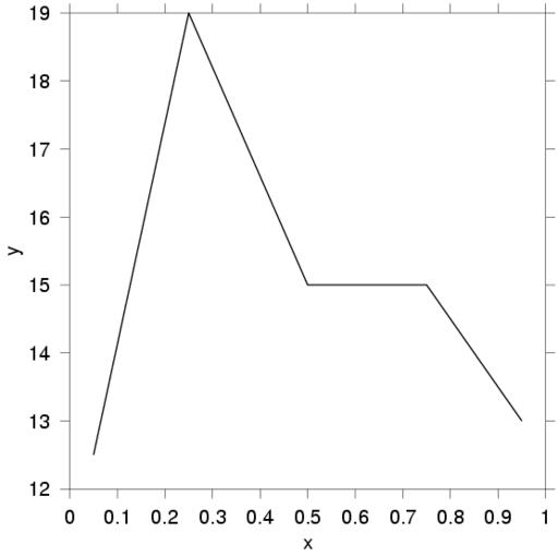
Figure 1. A Simple Line Graph Produced by Gri
The example illustrates a few things. To begin with, Gri syntax is simple, being patterned on English and purposefully using a minimum of punctuation. For example, the open command takes as an argument the name of the file containing the data. This file name is not enclosed in parentheses, as it would be in a subroutine-based language. We think the lack of parentheses makes Gri easier to read than some languages. Nor is there any need for the file name to be enclosed in quotation marks, although these are required for file names with spaces in them (and for pseudo-file names created by UNIX pipe commands, which are supported in the Perl style).
Now let’s move on to the read line. Gri knows of four types of data: scalars, columns, grids and images. These types are what you’d expect: scalars hold numerical values or strings, columns hold lists of numbers, grids hold two-dimensional matrices and images hold pixels. Each data type has a host of associated read commands and data-processing commands. Folks who are used to programming languages should note that Gri is an illustration-oriented language, not a programming-oriented one, so it attaches special meanings to columns. Thus, the columns named x and y in the example above correspond to the x,y values in a Cartesian space. Gri also has a column named z used for gridding, a column called w used for weights in statistical operations, columns called u and v for vector fields, etc.
The draw curve command tells Gri to draw a curve composed of line segments connecting these points. You may not be surprised, given the focus on drawing, to learn that Gri has many options for draw–over 40, in fact. For example, to get symbols drawn at the data points, you could add the line draw symbol someplace after the read command. This will draw bullets at the x,y points. Bullets are the default, but Gri provides a dozen other symbol choices. The symbols are designed according to the recommendations of scientific journals and technical-drafting texts. For example, efforts have been made to ensure that the superposition of any two symbols does not result in a symbol that can be mistaken for a third symbol type. The default symbol size is a diameter of 0.1 cm (defined in the expected way for a bullet, and in a reasonable way for non-circular symbols). If this doesn’t suit your application, you could issue a command such as set symbol size 0.2 to create larger symbols (in this case, 0.2 centimeters). This is by no means the only set command. It has many options, since Gri is designed to be configurable. Indeed, there is an average of nearly two set commands for each draw command.
In addition to such basic commands and a few others discussed next, Gri provides programming features such as “if” statements, loops and system calls. It also provides a simple scheme for creating new commands to complement the existing commands; e.g.,
Draw Logo
{
... Gri commands to draw a logo
}
creates a new command to draw a logo. This command is invoked by Draw Logo, just as if it were a built-in command. Many users store such definitions in a file called ~/.grirc and thus customize Gri for the sort of work they do.
Gri updates its PostScript output file step by step as it processes commands. When Gri executes any drawing command, the item is drawn with whatever settings (fonts, colors, line widths, etc.) are in place at that time. To use an artistic analogy, draw will paint with whatever color has been stored on the brush with the most recent set command. Many other scripting graphic languages follow a different approach, with some commands being able to alter the form of material that has already been drawn (e.g., axis in matlab). Such languages are meant to be used interactively in an exploratory way, so it makes sense to have this out-of-order processing. However, Gri processes commands in order, because it is designed to be used non-interactively in a planned way.
Gri scripts are not typically written in one large chunk. Instead, Gri users typically write their scripts a bit at a time, running Gri at frequent intervals to see what the results look like. Some like to keep a PostScript viewer open at all times, clicking on an update button every time they run Gri. Most Gri users run it from inside Emacs, which has a button that runs Gri and displays the output. This is but one helpful feature of the Gri Emacs mode. It also provides syntax coloring, indentation, linkage to the on-line Gri documentation, command-specific help, command completion and a search facility that lists all Gri commands containing a given word.
Contour Graphs
Whereas line graphs can be accomplished in as little as three commands, contour graphs are not much more complicated. Suppose we have a file called temp.dat that contains measurements of ocean temperature made once per decade, over the period from 1950 until 2000, at depths of 500 meters, 400 meters, 300 meters and so on, up to the surface at 0 meters. The natural way to store such a dataset is in a matrix or “grid” in Gri. There are three steps to drawing this in Gri.
# First, set up the x,y vertices of
# the grid ...
set x grid 1950 2000  10
set y grid  0    500 100
# then read the grid data ...
open temp.dat
read grid data
# and plot contours:
draw contour
As you can see, comments in Gri start with the pound sign, as in many other scripting languages. In this example, a uniform grid is used (i.e., time increasing by 10 years between samples), but non-uniform grids are also easy to handle. For many applications, grids are read in from data files instead of being specified in the command file. As for the drawing of the contours, that’s fairly easy since Gri can determine, by scanning the grid, a reasonable default range of contours.
Image Graphs
Images are not much harder to deal with. There are many image formats in this world, and Gri handles only a few. This causes few problems, since good conversion programs are available (e.g., ImageMagick). Let’s suppose we have a raw (headerless) image file in 8-bit resolution. The 8-bit pixels have 256 possible values, in the range 0 to 255. Satellite-derived measurements of ocean temperature are typically in this format. A common scale for the data is that 4.9 Celsius gets a pixel value of 0 while 30.4 Celsius gets 255, with linear variation in between. Let’s say that the image is 512 pixels by 512 pixels, and that the geographical coverage spans a box with the lower-left corner at x=0 and y=0 and the upper-right corner at x=20 and y=20. We want the image drawn with blue for cold water and red for warm water. Listing 1 shows how to handle this in Gri. As you can see, it is quite easy to make Gri create line graphs, contour graphs and image graphs.
Listing 1. Drawing Image Graphs
# Establish range stored in image.
set image range 4.9 30.4
# Set up a color scale ranging from blue at 4.9C
# to red at 30.4C, in a spectrum. These endpoints
# are specified in HSB coordinates, where H is the
# hue, S the saturation and B the brightness. The
# HSB triplet 0.666 1 1 is saturated blue, and
# 0.000 1 1 is saturated red. We run over hues to
# get a spectrum. Note the use of backslash for
# continuation across lines.
set image colorscale hsb 0.666 1 1  4.9 \
  hsb 0.000 1 1 30.4
# Read a 512by512 image that spans a box with x=0
# and y=0 at the lower-left corner and with x=20
# and y=20 at upper-right.
open temp.dat binary
read image 512 512 box 0 0 20 20
# Draw the image.
draw image
A quick note about file names and other properties. In the examples given so far, we always specified the names of the data files in the script, but that means users have to modify the file for use with other data. For this reason, many scripts use a command called query to ask the user the name of the input file. This command stores a user’s answers into variables that may later be used in open commands. The query command has an option to provide a list of permitted answers (e.g., “yes” and “no”) so that users cannot make mistakes. In many laboratories, query is used extensively, so that novices can use complicated Gri scripts without having to edit Gri scripts they don’t yet understand. This lets students dive into their research instead of getting too distracted with the tools of the work.
Radionuclides Reveal Ocean Mixing
Let’s turn to a more complicated example, based on an illustration from one of our research papers. Here, and in the remainder of this article, we will show only fragments of the Gri code, to illustrate topics not already covered.
A key issue in understanding the climate system is the interaction between the ocean and the atmosphere. The heat capacity of the top three meters of the ocean is equal to that of the entire atmosphere, but everyone knows the ocean is more than three meters deep. In fact, the mean depth is more like three kilometers. Given this, it is not surprising that the ocean is important to the heat balance of the planet and thus to the climate system. Beyond the ability to soak up heat from the sun (or re-release it), the ocean has currents that transport heat from one location to another. The exact pathways of this transport are not fully mapped out yet, and we are still unsure of some fundamental dynamical aspects of the system. A great deal of evidence suggests that vertical mixing in the ocean is very important to these patterns of heat flow. Thus, ocean mixing is important not just to the ocean itself, but also to the whole climate system. This is a prime motivation for studies of ocean mixing, which is our research specialty.
One good way to observe mixing is to insert a tracer and see where it goes. This is not as easy as it sounds, so oceanographers also make great use of tracers that are naturally occurring or introduced without the specific intention of studying mixing. An example of the latter is a suite of radionuclides introduced into the atmosphere by atmospheric bomb testing carried out by the U.S. and the U.S.S.R. in the 1960s. These radionuclides have found their way into the ocean. One radionuclide, a hydrogen isotope named tritium, is especially useful for studying ocean mixing. Figure 2 shows a plot from a paper (see Resources) in which one of us, together with a geochemist colleague named Kim Van Scoy, tried to work out the rate of ocean mixing by tracing the movement of tritium over several decades.
Figure 2. A Contour Illustration, Showing the Depth of Maximal Concentration of Tritium in the Ocean
Our approach was to do time derivatives of properties that are spatially averaged over a particular geographical area. The area is defined by the streamlines of the average ocean circulation pattern. Now, averaging gridded data is easy: just sum along the rows and columns of the grid. Unfortunately, however, our observations were not made on a grid. As Figure 2 shows, the observations are at manifestly non-uniform locations which correspond to ship tracks on cruises designed with other goals in mind. Our first step, then, is to cast these x,y,z data onto a uniform x,y grid. After reading in the columns and setting up an x,y grid (exactly as discussed above), we create the grid by using
convert columns to grid barnes
This is our first example of a convert command. Commands in this category perform conversions from one data type to another. Since contouring works on a grid, we must convert column data into the grid. In this case, we have chosen to use the so-called “barnes” method of gridding, which is but one of several gridding methods in Gri (see Resources). The method applies a Gaussian-weighted low-pass filtering (averaging) scheme that is run iteratively. Initial iterations map out the large-scale variation in the field, while later iterations fill in details in regions where the data sampling is intense enough to justify doing so.
In the previous example, we let Gri pick contours; in fact, that is how we started out with the working plots that led to the diagram shown in Figure 2. For publication, however, we ended up deciding to highlight certain contours by drawing them with thicker lines:
set line width rapidograph 00
draw contour 50 unlabelled
set line width rapidograph 2
draw contour 100
where the “rapidograph” method of naming line thicknesses by the scheme used for Rapidograph technical fountain pens has been used. Line widths may also be given in units of printer points.
At this stage, we had the scientific result we wanted. We used the Gri command write grid to write the gridded data into a file, then we integrated the values with a Perl script (called from within Gri with a system command), then we were done with part of the work. For presentation, we wanted to draw this in a map format, so we started by customizing the axes a bit:
set x name ""
set y name ""
set x format %.0lf$\circ$
set y format %.0lf$\circ$
The first two commands remove the names x and y from the axes by setting the names to blank strings. The second two set the format of the axis numbers, using the notation of the C programming language. We also added a LaTeX-like part to the format (enclosed in dollar signs) to make Gri draw degree signs for longitude and latitude. Gri can draw Greek letters and mathematical symbols in this way, although the emulation of TeX is by no means complete, since it is a daunting task.
A map isn’t too helpful without coastlines. Since coastline files are quite big, our system retains the data in a binary format for quick reading. We use the format called netCDF, which is quite popular in earth science (see http://www.unidata.ucar.edu/packages/netcdf/). Out of the many advantages to this format, one is quite relevant to Linux users: it is fully binary-compatible across big-endian and little-endian computers and across computers with different word lengths. It also permits naming of data entities, so you don’t have to remember that the first column is latitude and the second longitude, or vice versa. Gri handles netCDF format easily:
open map_land.nc netCDF
read columns x="lon" y="lat"
is all it takes to read the coastline data. We’ll fill in the coastline with a light brown color, and then draw a black coastline:
read colornames from RGB "/usr/lib/X11/rgb.txt"
set color burlywood
draw curve filled
set color black
draw curve
In addition to X11-based colors and a dozen or so familiar colors above like black, Gri permits you to specify colors in either an RGB or an HSV framework.
Viewing the Ocean with Satellites and Ships
Speaking of colors, a common application of Gri is generating illustrations of color images. Within oceanography, such images often fall into two broad categories: fields generated by numerical models and fields generated by satellite observation. In each case, the advantage of Gri over tools that are more image-based is that Gri invites the user to draw other graphical elements as well as the images.
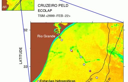
Figure 3 provides a good example, showing some of the work in the ECOLAP program, spearheaded by oceanographers at the Rio Grande University in Brazil (see http://www.peld.furg.br/). This research group has a ten-year program to measure and understand the physical and biological variability of the Brazil Rio Grande estuary and the adjacent sea. Figure 3 shows a satellite image of ocean temperature, and the location of ship-based observations made on 22 February 2000. Land is colored a ruddy brown in the figure, and the palette indicates sea surface temperature as measured by the satellite. The processing of the satellite image is done exactly as described in the more hypothetical example given near the beginning of this article. The two panels are drawn simply by changing axes and redrawing. The palette was drawn with a command called draw palette, the guiding lines were drawn with the commands draw box and draw line and the labels were drawn with draw label. By now, you may be getting the impression that it’s pretty easy to guess the names of Gri commands. This guessing isn’t necessary; just type “draw” in the Emacs mode and press the ESC key followed by the TAB key, and the mode will display all commands starting with the word “draw”, i.e., all drawing options.
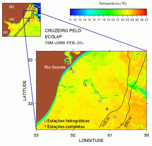
Figure 3. Image Showing Satellite-Derived Sea Surface Temperature East of Brazil, Uruguay and Argentina
A noteworthy feature of Figure 3 is the use of symbols to indicate the locations at which ship measurements of ocean properties were made. These ship-based observations usually run from the ocean bottom to the surface, and typically involve measurements of physical properties of the water as well as biological properties, such as the occurrence of different species through the depths. In past decades, oceanographers were greatly challenged to explain patterns in ship-based observations, and Figure 3 illustrates why. Consider the ship sample near the middle of the larger image. It lies in a thin filament of cold water (green color), whereas the other samples lie in warmer water. To some extent, the biology is just “along for the ride” as currents move water from one place to another, so it might not be surprising if this middle sample had different biological characteristics (e.g., species typical of cold water) than the nearby stations. The superposition of satellite and ship data on one graph, which is so easy to accomplish in Gri, provides a powerful insight into the systems under study.
It almost goes without saying that the script-based nature of Gri is important in constructing such diagrams. Nothing about this diagram was prepared with a mouse, and nothing in the Gri script requires modification for another cruise of the ship (since query commands are used to set up all file names). As soon as the ship does an observation and a latitude-longitude pair is written in a data file, the Gri script can be rerun and a new diagram prepared.
New Ways to Measure Ocean Mixing
Understanding turbulent flow is one of the grand challenges in physics, and ocean mixing provides a good example. The ultimate goal is to be able to predict mixing, which is a small-scale phenomenon that is difficult to measure, based on large-scale properties that are easy to measure. One proposed technique is to examine vertical variation of water density on intermediate scales. If this can be done, it will greatly expand our database of ocean mixing knowledge, since density measurements are common. But can it be done? This question was addressed in the Ph.D. dissertation of the second author. Figure 4 shows a diagram patterned after a paper about this work. The illustration shows two things. The red image shows a theoretical prediction of where mixing should be occurring, through time and through depth. The blue-filled curves show where mixing actually occurred.
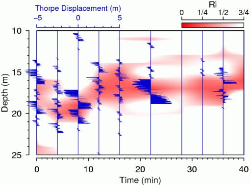
Figure 4. Indicators of Mixing in Surface Regime of Ocean
To be more specific, the red image shows the so-called Richardson number. Theory indicates that the type of mixing known as Kelvin-Helmholtz overturning can occur only when the Richardson number, a measurement of the competition between stabilizing and destabilizing effects, falls below a critical value of 1/4. We measured the variation of the Richardson number over depth and time on a grid. Our first inclination was to contour this, but since we wanted to superimpose other things, we decided to use an image instead for clarity. The gist of the Gri code can be guessed from what you’ve read so far, the only new feature being the use of the command convert grid to image to transform our grid data into an image that can be colored. We drew the image in shades of red by running the color scale across intensities of the red hue, instead of across hues as in the previous example. We did this because we wanted to superimpose another curve of a certain color, and that would be difficult to discern with a spectrum below. The image indicates that mixing should occur in a band that lies roughly at 17 meters deep and that this mixing band should bob up and down over the time of observation.
With the theory painted in red, we’ll turn to the observations. Blue seemed to look pretty, so we started by drawing blue vertical lines corresponding to the times when a density-measuring probe was lowered from the side of the ship. We call the density variation with depth a density “profile”. The seawater density in the ocean normally increases with depth, because heavy water sinks and buoyant water rises. However, eddying mixing motion can overturn this density profile, momentarily lifting heavy water above light water. With sufficiently precise density probes, this sort of mixing can be revealed graphically by plotting the difference between the observed density profile and an artificial profile created by reordering the density data to make density increase monotonically with depth. We keep track of the distance individual points had to be moved in the reordering process and call this the “Thorpe displacement profile”. This profile gives an indication of the intensity and extent of mixing patches. We draw these Thorpe profiles with a filled curve, as in the command
draw curve filled to x 0.0
We do this once for each profile, after first redefining the axes so that x=0 corresponds to the time of the ship observation.
You may agree that the observations are in rough agreement with the theory, since the observed depths and times of high mixing rates (blue curves) appear to match with the theory (red image). The main implication of this is not that low Richardson numbers yield mixing; we already knew that, from experiments in the field and in the laboratory. Rather, the main implication is that our density probe is capable of picking up mixing signals of this particular strength. This is important, because the instrument we were using is much more common than the instruments normally used to measure mixing. For more on how and why the technique works, we encourage you to consult our paper, which, we might add, employs Gri for every figure.
Notice that the axes in this diagram lie outside the box in which the data are drawn. The second author prefers this style, while the first prefers the conventional style. In this, as in most things, Gri offers you a choice.