 Linux, Linux OS, Free Linux Operating System, Linux India Linux, Linux OS,Free Linux Operating System,Linux India supports Linux users in India, Free Software on Linux OS, Linux India helps to growth Linux OS in India
If you need to graph data, there are two packages available for Linux under X: Gnuplot and Xmgr.
Graphing data is one of the oldest uses for a computer, dating back to FORTRAN programs producing character graphics on line-printers. Fortunately, things have advanced somewhat, and modern computers are capable of producing much nicer graphs. Several graphing packages are available for Linux under X and SVGALIB. Two of the most prominent packages are gnuplot and xmgr (a.k.a. ACE/gr). Xmgr is oriented towards graphing and manipulation of externally produced data sets, while gnuplot is used more for plotting data and mathematical functions.
Gnuplot’s primary authors are Thomas Williams and Colin Kelley, with many others contributing. Although gnuplot was written independently of the Free Software Foundation, the FSF does distribute it. Gnuplot was written with portability in mind, supporting about four dozen output devices and formats under a dozen operating systems. Under Linux, it will run under both X and SVGALIB. Modifying gnuplot to support a new device involves writing a few device-dependent subroutines that are linked in with the main program.
Xmgr, on the other hand, is tied to X. Developed by Paul Turner, it also runs on many platforms besides Linux, but it outputs only PostScript. In the latter stages of development, Linux was the primary development platform. Development has recently been spread around to a loose organization of interested people.
Gnuplot
Gnuplot has a command-line interface with a mixture of emacs and Unix command line editing similar to the bash shell. Gnuplot may be run in batch mode, where the commands are taken from a file. The plot command causes a plot to be sent to the currently selected device. In the case of the Linux svgalib driver, a graphics mode is selected and a graph is drawn in the current virtual console. When a key is hit, the display changes back to text mode for an additional command. Under X, a new window is created for the graph, while commands are entered in the original shell window.
Gnuplot has a comprehensive on-line help facility that can be accessed by typing help. The basic help command lists arguments of the help command by topic. Some subjects, like the set command, have many sub-topics. The documentation itself is well written and has many valuable examples of working commands.
A datafile containing points to plot is identified by the file name in single or double quotes. Each line has a two or more space-separated numbers that correspond to a point that is to be plotted. For example, suppose we had a file named “hits”:
# Monthly hits on our web site
1   13
2   23
3   66
4   75
5   74
6   82
7   377
8   442
9   512
10  756
11  874
12  946
The command plot “hits” would plot a graph of the data in the file named hits. Lines in a data file beginning with a # character are treated as comment lines. Blank lines are not treated as comments. Instead, they indicate where a line should not be drawn between a pair of points.
Although our example has the x data listed in the first column and the y in the second, gnuplot can handle cases where this is not so. The command:
plot "hits" using 2:1
would cause the x data to be read from the second column and the y data from the first column.
Plots can be embellished in many ways. Each comma-separated file or mathematical expression (shown later) to plot has two attributes that can be specified by the user: a title and a style. A gnuplot “title” is a string that is displayed with an example of the plot style that labels that data; this is usually called a “legend” by other programs. The style of the plot is selected from several possible ones, including “points”, which displays a symbol at each data point, “lines”, which draws lines between the points, and “linespoints”, which draws both the lines and the symbols. The color of the line and symbol as well as the type of symbol (plus sign, cross, box) are normally assigned in series by gnuplot to make each distinct, but these can be overridden by the user.
For example, the command plot “hits” title ‘Hits on Website’ with linespoints 3 4 plots our data file using lines of type 3 and points of type 4. At the top right will be the string Hits on Website next to a short example of type 3 lines and type 4 points. What you actually see depends on the output device being used—lines that are colored on a color display can come out dashed and dotted on monochrome devices (like most PostScript printers).
Our plot is looking better, but it is still not perfect. We want to put labels on the x and y axes to further clue the reader in on what we are looking at. Axis labels are setable parameters, as is the graph title:
set xlabel "Month"
set ylabel "Hits"
set title "Hits on the Website"
replot
Experimentation is easy to do in gnuplot by using the replot command, which repeats the previous plot command. Not only does this save keystrokes, but the author has a friend who likes to type replot repeatedly to display a file being appended to by another job he is running, which gives a running display of results as they are calculated.
Our graph is almost finished. Gnuplot’s default algorithm for deciding where the x tick marks appear is showing only every other x point. We can make it show them all by:
set xtics 1, 1
replot
The first number causes the tick marks to start at x=1, and the second causes them to be spaced one unit apart. We could have included a third comma-separated parameter to indicate where the last tick mark should be plotted, but it is unnecessary in our example.
We can do better than month numbers:
set xtics ("Jan" 1, "Feb" 2, "Mar" 3, "Apr" 4,
    "May" 5, "Jun" 6, "Jul" 7, "Aug" 8, "Sep" 9,
    "Oct" 10, "Nov" 11, "Dec" 12)
replot
We have arrived at a graph worthy of being shown to the boss. The result is shown in Figure 1.
All that remains is to print it out. Gnuplot treats printers and plotters as just another output device. Executing the command:
set terminal PostScript
tells gnuplot to generate PostScript of the graph instead of console graphics. It is not enough to set the type of terminal. Typing replot now will cause gnuplot to spew PostScript to the user terminal. The command:
set output "graph.ps"
replot
will cause PostScript to be sent to the file graph.ps. If the first character of the filename is a vertical bar, gnuplot interprets the rest of the string as a program that will accept gnuplot’s output as its standard input. So a command like:
set output "|lp"
replot
sends the output to the system’s default printer.
Plots of mathematical functions are easy to produce: plot 2*x will produce a plot of a line with a slope of two on the default range of -10.0 to +10.0. The y-axis is automatically scaled by default so that all points are visible. For a mathematical function, the x range is taken from a default range. Multiple plots can be overlaid, with separate expressions separated by a comma.
A wide variety of common mathematical functions can be used in expressions—trigonometric, exponential and logarithmic as well as less common functions such as bessel functions and error functions. Expressions are based mostly on C-style expressions including the logical AND (&&) and OR (||) operators with the notable addition of the FORTRAN power operator (**).
Ranges are specified by a pair of numbers separated by a colon enclosed in square braces. Either or both numbers may be omitted to avoid affecting the current default. The first number specifies the range to begin and the second specifies the end. If we wanted to look at several graphs with the same range, the default range can be changed with the command set xrange [1:2]. If we wanted to change the range in only one plot, a range can be specified before the first function being plotted.
| Figure 1
|
Figure 2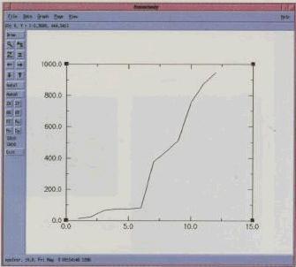 |
Figure 3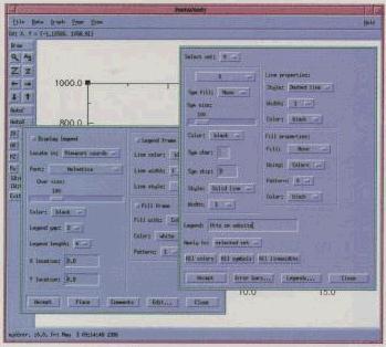 |
Figure 4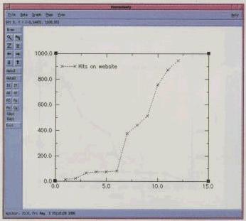 |
Figure 5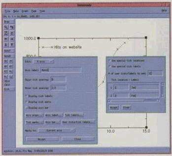 |
Figure 6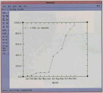 |
Figure 7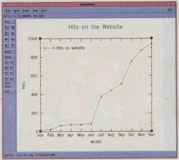 |
Figure 8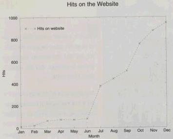 |
Advanced Gnuplot
Three dimensional surfaces can be generated with the splot command, which has syntax almost identical to plot. An additional range specifies the range of the y variable and the set view command lets the user control the orientation of the plot in space. A simple example would be:
splot x*x-y*y title "Hyperbolic Paraboloid"
Gnuplot also supports hiding lines that are behind other lines with the hidden3d parameter: set hidden3d.
Gnuplot can plot “parametric” functions. A parametric function is one in which both the x and y coordinates are functions of a third variable, which in Gnuplot is t. For example:
set parametric
plot 2*sin(t), 2*cos(t)
produces a circle of radius 2. The command:
set trange <range>
sets the values of t that are evaluated. Parametric plots are also valid while doing a three-dimensional splot. In this case, the independent variables under gnuplot are u and v.
Gnuplot can also take data points from the standard output of a Unix command specified on gnuplot’s command line. This allows the display of points generated from almost any source. The command should be specified like a filename, preceded by a < character.
Xmgr
Xmgr is oriented more towards plotting data created from an external source, as opposed to plotting a given mathematical function. Xmgr normally reads files, but can also take input piped from its standard input. Once data has been read into an xmgr set, it can be displayed, scaled, and manipulated in many ways.
Xmgr also has an on-line help. When the “help” menu is selected, xmgr runs your favorite HTML browser (Mosaic by default) with the xmgr documentation as input. Several sites on the internet have this page on-line. If you don’t have a browser, you end up having to read raw html. Having a program’s documentation as a hypertext document is quite nice, as you can jump from subject to subject as well as being able to do text searches. A gallery of graphs produced by xmgr is also included with the xmgr distribution, which gives the user a visual look at the wide range of effects possible with xmgr.
The first step in graphing some data is to read the data into xmgr. The “Read Sets…” option under “File” produces a file browser from which a file can be selected. Several types of data can be read in, but the two column “XY” format is the most common. The format of the data is much the same as in gnuplot—individual points on lines by themselves separated by spaces or tabs. Lines beginning with # are also considered comment lines, and lines without numeric data (like a blank line) separate sets. Lines beginning with the @ symbol can control the actions of xmgr separately from the user.
Xmgr data sets are somewhat like registers, in that only a fixed number are available (fixed at compile time), and they are referred to by number. Once the data is in a set, it is displayed immediately. The left hand side of the xmgr window contains a number of buttons that provide shortcuts for various operations.
Most of the shortcut buttons let the user change the appearance of the graph interactively. A set of four arrow buttons scrolls the data in all four directions—tick marks and tick labels are automatically updated. The “Z” and “z” buttons allow uniform zooming in and out. Arbitrary zooms in are accomplished by using the magnifying glass button. This prompts the user for a rectangle that becomes the new limits of the graph. A text line at the top of xmgr’s window constantly displays the current position of the mouse, in the coordinates of the graph. A crosshair extending the length and breadth of the window may be toggled to help position the mouse within a pixel of the desired point.
The “autoO” button provides an autoscaling feature. The cursor changes to a crosshair, which when clicked at some point selects the set nearest to the clicked point. The graph is rescaled such that all points in this set are visible. The “autoT” button immediately rescales the tick marks that can get cramped while doing a zoom.
Each data set has several attributes that control how the set is displayed—which symbol is used for points, the color of the symbol, whether the symbols are connected by lines or not, the color and style of the lines, the legend associated with the data set, and more. One rather packed menu controls all these options.
The user has a great deal of control over how the graph is displayed. Major and minor tick marks chosen by xmgr can be overridden. Simple box and line graphics as well as text strings can be drawn at arbitrary locations. All strings can be displayed in a variety of fonts and sizes, with subscripts, superscripts and some special characters available.
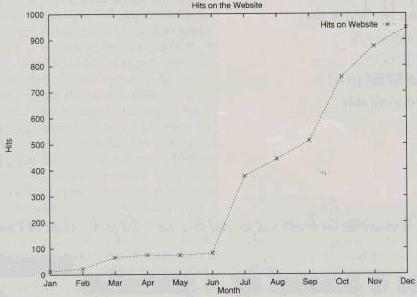
To repeat the earlier example using gnuplot, Figure 2 shows the xmgr display immediately after loading the hits file. Figure 3 shows the symbols and legends menu used to control the appearance of the set and the set’s legend respectively, while Figure 4 shows the results. Figure 5 shows us getting ready to fix the X-axis by replacing the numbers with month names with the result in Figure 6. Figure 7 is after the final touch-up, adding a title, giving the Y-axis a name, getting rid of the tenths digit in the tick labels and expanding the X-axis to fill the entire bottom of the graph. Figure 8 is the final PostScript output.
Advanced Xmgr
Once it is in an internal set, the data can be manipulated in many ways. Sets may be edited, deleted, and saved. Arbitrary mathematical functions can be typed in to transform one set to another. Regression, sometime referred to as “curve-fitting”, can be done on a variety of standard curves—polynomial, logarithmic and exponential. Histograms can be created from sets with user-definable bin widths. Many other mathematical operations are supported. Individual data sets (as well as complete graphs) can be saved and loaded.
Xmgr also allows the user to define “regions” entered as polygons determined by mouse clicks. Data points within a region can be extracted from data sets into other data sets or removed from data sets. The regression options may also be set to operate only on the inside or outside of a particular region.
More Information
Gnuplot has its own Usenet newsgroup, comp.graphics.gnuplot. The current version is 3.5. Gnuplot can be downloaded from Gnu ftp sites like prep.ai.mit.edu and its mirrors.
The gnuplot 3.5 distribution comes with a tutorial written in LaTeX. The regular gnuplot documentation can be compiled into several different formats, one of which is the on-line help file. Other formats are a VMS .hlp file, a TeX document, nroff/troff format and an .rtf rich-text format. A man page is also provided, which talks about invocation options and X-resources that are used.
The current version of xmgr is 3.01. Xmgr has a home page located at www.teleport.com/~pturner/acegr/index.html. FAQs, on-line documentation, source and binaries are there. Other pages still have some dangling pointers to the old xmgr home page at ogi.edu, where the mailing list is still hosted.